
This year, I’ve asked a few Phoenix-area musicians/people of interest for their year-end, best-of lists: albums, songs, whatever. This installment comes from Zachary James Dodds, who played guitar in the Via Maris and whose solo EP, One More Life, I reviewed for the Phoenix New Times.
Zach gives us a fresh take on a year-end list (at least on this site): best album covers. (He even saved me the dirty work of finding the jpegs myself.)
During my high-school years, my family and I would go to Borders every Thursday night to have a media holiday. My parents would spend the time reading books and sipping coffee in the café of the store, and I would check out new CDs at the store’s listening stations. This was before MySpace, Pitchfork or Pandora were around to help streamline the hunt for new music. When I approached a CD, there were only two factors to convince me of whether I wanted to give it a try. The first factor was a write-up that Borders would place under the CD telling about the artist’s musical style, similar artists, and specific highlighted tracks. The second factor was the album art. It was only because of intriguing album artwork that I initially took a chance on records like Wilco’s Yankee Hotel Foxtrot and Daft Punk’s Discovery. Even though album art has shrunk from the original glory of a 12.5†vinyl record sleeve to the current 1.75†iTunes image, I am still fascinated by it and view it as an integral part of any music release. With that, I present my picks for the Top 10 Album Covers of 2008:
(Click thumbnails for larger image)
1. Fleet Foxes by Fleet Foxes
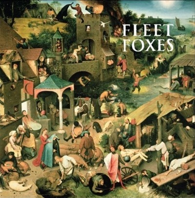 This cover worked exactly how covers should work. I had no knowledge of Fleet Foxes, yet when I saw this cover posted in a blog, I was taken with it, did a Google search, and was soon enjoying Fleet Foxes’ music. The original painting, “The Blue Cloak†by Pieter Brueghel the Elder, was an excellent choice by the band and is gorgeous in its own right. The text fits the style of the painting and is balanced as not to intrude on the picture, yet not allow the band name to be ignored by its viewer. Perfect.
2. Saturdays = Youth by M83
 By far, some of the best portrait photography I’ve seen. It’s intentionally styled with a 1980s look, as the album is a tribute to Anthony Gonzalez’s teenage years that took place during the same decade. The references to films such as The Karate Kid, Sixteen Candles and A Nightmare on Elm Street add nostalgia and fun to it as well. I like the use of a park as the background of the shot. It serves to reinforce the dichotomy of innocence and corruption in the teen years. The grass hasn’t been paved with concrete and the trees aren’t cut down for buildings, but the grass has been mowed and the trees have been segregated. It’s beauty with an edge.
3. Feed the Animals by Girl Talk
 In my opinion, there are two main interpretations of this cover. One is that it is referencing the Crann Tara tradition in Scotland in which a burning cross was used to alert townspeople that war was coming and they all needed to arm themselves. The second is that it’s referencing hate crimes. Assuming the light in the house is that of a teenager’s, my guess is that the cover is depicting a call to arms for all Girl Talk fans to defend their love of the groups explicit hip-hop, or a Girl Talk hate crime against an N*Sync fan. Whatever it may be, it’s a very striking image done very well.
4. Crystal Castles by Crystal Castles
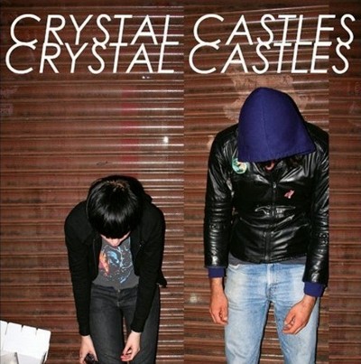 Much like Rio by Duran Duran screams 80s, I think this will be an album cover that will eventually scream 00s, and that’s why I love it! It uses flash photography that has become fashionable this decade thanks to the resurgence of Polaroid cameras and nightlife blogs such as The Cobrasnake. In addition, Ethan Kath is sporting a hoody/leather jacket combo and Alice Glass is wearing a vintage t-shirt, both styles that have become popular in recent years. Artistically, the 00s have been a decade about breaking basic aesthetic rules – off-center graphics on shirts, oversized and pixelated fonts, out-of-focus pictures – and this cover breaks the artistic rule that says album titles should be written 3, 5 or 7 times if they’re going to be repeated. Having “Crystal Castles†written twice is a violation, and thus is even more 00s! Right on. It also doesn’t hurt that Alice Glass is a babe and a half.
5. Forth by The Verve
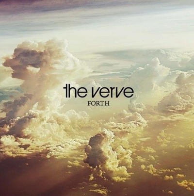 The Verve’s last record, Urban Hymns, was released 11 years ago, sold 8 million copies and yielded the hit single Bittersweet Symphony. With that in mind, I think this cover of an epic, sprawling and heavenly cloud-scape is what the band needed in order to live up to its hype and assure everyone that they were back and were going to be even more massive than before. Although the record received good reviews, it hasn’t surpassed Urban Hymns in praise, sales or fame. However, of all the covers this year, this is the most grandiose, and is tied with Fleet Foxes for the one most likely to look good as a poster on a wall.
6. When Life Gives You Lemons, You Paint That Shit Gold by Atmosphere
 In keeping the artwork extremely simple, using gold ink for the cover, and embossing the letters, Atmosphere did a great job of emphasizing their humorously blunt album title. Other artists might have put a naked woman in gold paint on the cover and served up sex appeal, but these guys kept the focus where it needed to be. Could the title also be addressing the issue of “fake it ‘til you make it†in the music industry? Wonderful simplicity.
7. Para Siempre [Special Edition] by Vicente Fernandez
 Vicente Fernandez looks, dresses and sounds awesome and has also stayed true to his regional Mexican music roots his entire career. The reason I love this cover is because it looks like all the rest of his covers. Something has to be said for not giving a damn about keeping up with the times, sticking to what one loves and being authentic.
8. Remind Me in 3 Days by The Knux
 Out of all the hip-hoppers, I’ve always admired the guys like Public Enemy, Outkast, and The Roots, who made it their goal to let their personality shine through instead of always playing the rich-badass-thug card. When I look at this cover, I see a very believable scene of rappers Krispy Kream and Rah al Millio chilling out. Through the men’s posture, expressions and clothing choice, they give off a vibe of being intelligent, hip, cool, confident and genuine; kind of like urban gurus. Mixed with the conflicting scenery of a beautifully hand-carved Victorian couch in a cracked-concrete alley, the cover is both cool and intriguing.
9. Keep Your Silver Shined by Devon Sproule
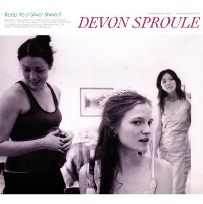 This is the kind of record cover that I find peace in on the days when I’m tired of the sometimes glam-stained and mellow dramatic antics of the entertainment industry. The cover has a classic layout and features a muted black and white picture of three friends in the midst of everyday life. Visually, it’s quiet, and that’s what draws me to it. It’s a refuge for the eyes that are tired of cover images screaming out for attention.
10. Pop Up by Yelle
 Putting the fun and energy back into pop music, French artist Yelle matches her cover to her own music perfectly. What you see is what you’ll hear. Simple as that. In addition, her jump is loaded with emotion. I’m gonna call it a sex-jump to rock ‘n roll heaven.
Related:
Favorite albums of 2008
Favorite song(s) of 2008
Guest list: Jim Adkins of Jimmy Eat World
Guest list: Brian Coughlin of Kinch
Guest list: Charlie Brand of Miniature Tigers
Guest list: Jay Wiggins (aka DJ Funkfinger)
Guest list: Brendan Murphy of Source Victoria
That’s not the real Crystal Castles album cover. Not sure why that jpeg is always associated with the album but if you buy the album there’s no text on the cover and the white thing in the bottom-left corner has been removed. You can see it on their page: myspace.com/crystalcastles
This is great– I love album art discussion. And I totally know where this guy’s coming from.
Addendum: Oi is dead-on about the Crystal Castles cover (thanks for the heads up). I confused the cover of the actual album with the cover for the single they released called Crimewave. Everything else still goes, but please void what was written about the text. Thanks!
-ZjD